Best homepage structure for a service business: an 8-section framework that converts
- Jun 7
- 6 min read

A beautiful homepage doesn't matter if visitors leave without contacting you. The difference between a high-performing and a struggling service business site isn't flashy design — it's strategic structure. When arranged correctly, every section works together to move visitors naturally from curiosity to action.
Table of Contents:
Here's a proven, 8-section framework built for B2B service businesses. Use this as your blueprint and watch your inquiry rate grow.
The 8 sections your service homepage must have
Section 1: Hero (what you do, in 5 seconds)

This is your only chance at a first impression. In about 5 seconds, a visitor decides whether to stay or bounce. Your hero section — everything above the fold — must instantly answer three questions: what do you offer, who is it for, and what outcome can they expect?
The structure: A clear headline that speaks to a specific problem or outcome. A supporting sub-headline that adds context. One primary call-to-action (CTA) button. Optionally, a secondary CTA.
Instead of writing "We're a digital marketing agency serving businesses across the country," try something like, "We help B2B engineering firms get qualified leads without cold calling."
Your primary CTA should be specific and outcome-driven. Use "See Our Case Studies" or "Get a Free Growth Plan" instead of "Contact Us" or "Submit."
Section 2: Trust signals (logos & proof)
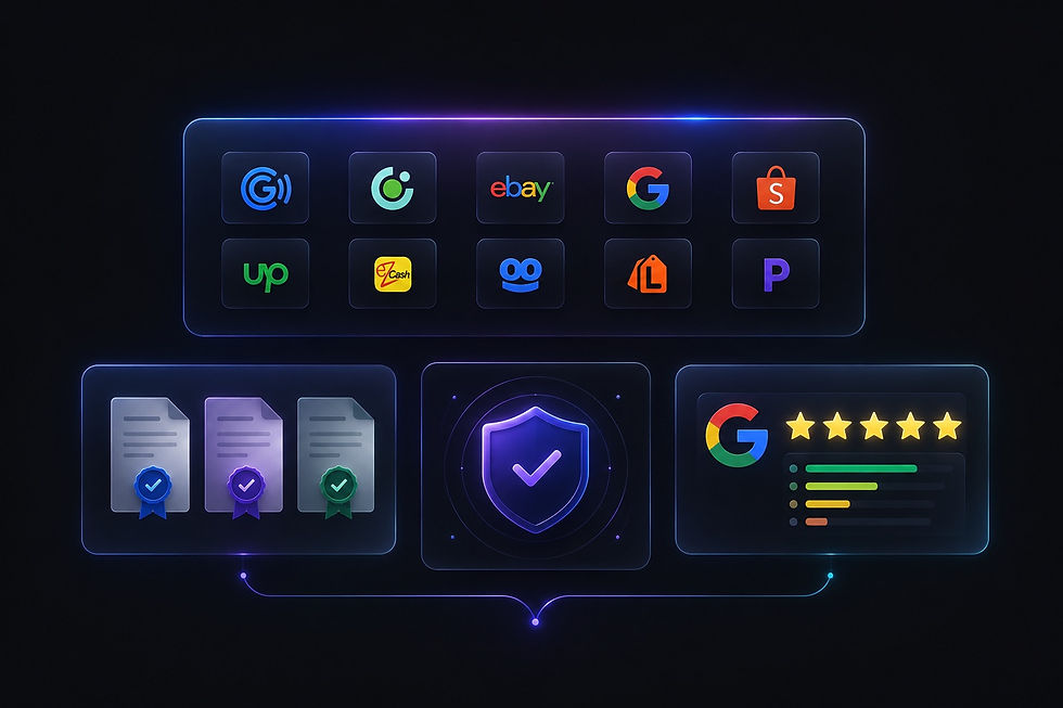
After the hero, a visitor's second question is almost always, "Can I trust these people?" This is where you prove your credibility.
Feature recognizable logos of current or past clients, especially from similar industries. Include accreditation badges, industry certifications, awards, or notable partnership badges. Show aggregate ratings, like 4.9 stars based on 50+ Google reviews.
Place these trust signals prominently, not buried in the footer. They act as shortcuts for busy B2B decision-makers who don't have time to vet a new vendor from scratch.
Section 3: The core problem you solve (customer‑centric)

Your homepage should not be about your company's history. In B2B service, the customer is the hero, and your role is the guide.
Start by naming the problem your ideal client is facing. Use their language, not corporate jargon. Instead of starting with, "We provide comprehensive IT security solutions," lead with, "Your outdated security protocols are putting client data at risk."
Then, outline three specific ways you solve that problem. This structure shows you understand the challenge and have a clear methodology.
Section 4: "How it works" (the 3‑step plan)

B2B buyers need confidence that you have a reliable, repeatable process. A simple "How It Works" section removes the guesswork and makes taking the first step feel easy and low-risk.
Map out your process in three steps. Use short, clear labels, like: "Discovery Call" → "Strategy & Plan" → "Implementation & Support." Where possible, include realistic timeframes for each stage.
This small section is surprisingly powerful. It signals to visitors, "We've done this before. We know what we're doing. And you won't be left wondering what happens next."
Section 5: Your core services (clarity, not options paralysis)
Many service businesses overwhelm visitors by trying to list everything they do. Instead, highlight your 3 to 5 primary services that deliver the most value to your ideal client.
For each service, write a short, benefit-driven description. Focus on the outcome the client receives, not your internal process or the technical features.
End this section with a clear next step — a link to your full Services page with a simple, "Explore All Services →" link.
Section 6: Social proof (testimonials & case studies)

For a B2B service, trust isn't just nice to have. It's everything. Your testimonial section should feature real client feedback with full attribution (name, job title, company name, industry). A photo or, even better, a short video testimonial, adds authenticity.
Where possible, include measurable results. Statements like, "They helped us reduce project turnaround time by 30%," are far more persuasive than, "Great service."
To make an even stronger case, link off to a detailed Case Studies page.
Section 7: Secondary CTAs (before the footer)

Most visitors won't convert on their first visit. That's normal. Your homepage should offer alternative, lower-friction ways to stay engaged. This is called a "secondary CTA."
Consider offering a gated content asset, like a free guide, checklist, or industry report. Invite visitors to subscribe to your email newsletter for insights. Or prompt them to browse your blog with a link to your most popular articles.
For the right-fit prospect who isn't ready to request a quote, these secondary options keep the conversation open.
Section 8: Footer (the safety net)

The footer is where people go when they want the full picture. Treat it as a site-wide utility tool, not an afterthought.
Include your main navigation links, like Services, About, Portfolio, and Contact. Add your social media icons, a condensed version of your "How It Works" steps or contact options, and your copyright line with any legal or policy links — Privacy Policy, Terms of Use, and Accessibility Statement.
A well-designed footer builds trust and helps search engines understand your site's structure.
The B2B homepage mistake to avoid
Packing too much, too high. Homepages are not brochures. Trying to say everything at once confuses visitors and dilutes your core message.
If you feel the urge to add more content, ask yourself: "Does this section directly help someone decide to work with us?" If the answer isn't a clear yes, it belongs on a different page, not your homepage.
Actionable homepage checklist
Use this list to audit your website right now:
Hero: Does it pass the 5‑second test? Can a stranger easily understand what you offer and who you serve?
Trust: Are client logos, ratings, or accreditations visible near the top?
Problem First: Is your messaging visitor-focused? Does the first sentence name an outcome or a problem, not your company history?
3‑Step Plan: Do you clearly show how the process works with realistic timeframes?
Core Services: Are you highlighting just 3 to 5 key offerings, with benefit-driven text?
Social Proof: Do you have real testimonials with names, titles, and results? Can visitors find case studies?
Secondary CTA: Is there a low‑friction way for visitors to stay connected before they convert?
Footer: Is it a solid, complete safety net with key links, social icons, and legal information?
Want a homepage that actually works?
A good-looking site that doesn't drive leads is just an expensive digital business card. Your homepage should be a conversion engine, attracting the right clients and guiding them toward a decision.
Explore our Web Design Services to learn how we build B2B homepages designed for lead generation. And check out our Portfolio to see real examples of service websites we've transformed.
Frequently Asked Questions (FAQ)
What is the most important section of a B2B homepage?
The hero section. You have roughly 5 seconds to make a visitor stay. A vague, company‑centric headline will drive people away. Be specific, name the problem you solve, and include a clear, benefit‑driven CTA.
How many services should I list on my homepage?
Focus on your 3 to 5 core services. Listing everything creates choice overload and can actually turn visitors away. Let your Services page handle the full list.
Should my homepage include a contact form?
It's not mandatory, but a short and simple form in the hero or the footer can be very effective. Keep it to just 3 to 5 fields. Remove friction by asking only for essential information.
How do I build trust if I'm a newer service business?
If you don't have many client logos, focus on other trust signals. Feature detailed case studies or before-and-after examples from early projects. Include a thorough, helpful "How It Works" section. Promote any relevant certifications or partner badges you've earned.
Is a video on the homepage a good idea?
A short, professional introduction video can be powerful. However, a low‑quality video can hurt credibility. If you choose this route, keep the video to under 90 seconds and make sure the sound and visuals are polished.
Can I copy a competitor's homepage structure?
Learn from them, but don't copy directly. Analyze how they've arranged their sections. Does it feel logical? Could it be more direct? The goal is to adopt best practices and improve upon them for your own unique audience.


